RULE OF THUMB: IF IT FEELS LOOKS RIGHT, DO IT!
You have a special dialog box for working with non-vectored type fonts. This box lets you choose the font, choose the font style, choose the font size, kern letters, set the leading, set tracking, set vertical and horizontal scale, set the baseline shift, rotate the character, and much more. Choose Window/Text/Character to bring up this dialog box.Below is a brief explanation of the different choices in the Character Dialog Box. Please study online if you want to know more about Typography. It is quite the journey and very rewarding.
Everybody does this. (smile)
Mandatory: Choose a Font
A basic tool of the graphic designer is fonts. Simply put, fonts are serif or sans serif. Sans is a word meaning "without." Sans serif fonts do not have projectiles or protrusions from the body. Serif fonts, on the other hand do have projectiles and protrusion from the type font body. When choosing a font for a logo design, you may have more choices than you should. Make sure the font makes sense for your type of business and make sure the font can be read easily. There is a two-second law, which I call the billboard effect. Can your words be read by a person in a speeding car passing by a billboard with your logo design?

Mandatory: Choose a Font Style
Fonts have different styles, and not all fonts have every style. When your font is selected, you can see the styles available for that font in the character dialog box.
Mandatory: Set the Font Size
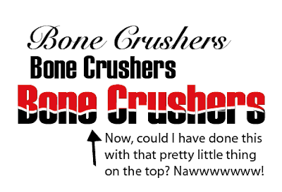
Font sizes are exact. A 10 point font is always a 10 point font. You can choose a font size from the dialog box, or type in a number that corresponds to the size you want. Point size 26 is not a predetermined selection, so I typed in the number 26 into the size box, and entered. It changed my font to point size 26. Although point size is an exact science for the computer, different fonts sizes have optical variations. For your example, I have chosen two fonts, one a serif and one a flourishing script. Each font example ends with the point size it has been given. You can see the difference in these examples easily.
The rest of these choices are for smart people. Want to continue? (smile)
Set the Kerning
Kerning is the space between letters in a font group (word).
Set the Word Spacing
Word Spacing is the space between words. You can use your kerning tool to do this, as a non-vectored font is seen by the Kerning settings even in the blank spaces.
Set the Horizontal Scale
Set the Baseline Shift
The baseline of a letter is the bulk of the letter, without descenders or ascenders.
Set the Leading
Leading is set only by the baseline of letters, not the ascenders or descenders.
Set the Tracking
Tracking is the way to space between letters in a whole word. Theoretically, if you have kerned the letters so that they all fit proportionately with each other, tracking should be successful.
Set the Vertical Scale
Notice that the changes in the vertical scale also sets leading accordingly.
Use Character Rotation if desired
Rotation is configured at every degree, completely at every angle. Usually, tracking has to be reconfigured for extreme rotations.
Your language should be set and we will leave anti-alias at default.
So that is your Character Box for Typography, and is probably the most useful tool I have ever used.
Have fun using it to configure your type.


No comments:
Post a Comment