Here is a simple gradation logo design.
Type gradation and turn it to vector. Use the Type/Create Outlines. Save a font that is not vectored in case you want it later.
Since I was going to do a gradation, I thought a simple vector of mountain shapes might be fun. So now, I have a mountain and vectored letters. Notice that the letters all touch the mountain at some point.
I could paint each of the individual objects with gradation, and they would look cool. But what I want to do is for the gradation to treat this design as though it is one single design. I will need to unite the design pieces into one single unit. There is a good tool for this. It is called unite, and it is the first tool you can choose in Pathfinder. Go to Window/Pathfinder. It brings up a dialog box that contains many manipulation tools. The unite is what we will use. Select 2 objects, then click the Unite tool. Do that for each letter, until the whole group is one vector.
When the whole vector is together, the Gradation tools will see it as one unit. Gradations can be applied to this from the gradation tool.
I made three of these blocks of design. One I made as black, a fill of black with a 3 point stroke gave it a heavy look. The next one I made is crimson with no stroke. The last one was made with yellow and black in a gradation, with a 50% transparency applied. The plan is to lay the crimson over the black, giving the opaque crimson a border striping of black because of the 3 point stroke from the black. The the yellow to gray gradation lays over the crimson. The 50% transparency of the gradation will allow the crimson to come through the yellow. It turns out a gorgeous orange sunset.
Tuesday, April 19, 2016
Kerning a Vectored Font
How to Kern a Vectored Font
First, type a word that needs to be vectored. Copy and paste that word. Pick the 2nd word, then go to Type/Create Outlines. The 2nd word is fully vectored. It is also by default, grouped. Select it and copy it, paste it into the 3rd position. That one should be ungrouped. As you can see by the 3rd word down, now any single letter can be selected. Copy it once again, paste it below as the 4th word. That fourth word will now be vectored. Each letter can be selected and moved by using the arrow keys on your keyboard. This will keep the letters perfectly aligned. Move them as needed to have a nicely kerned group of words.
First, type a word that needs to be vectored. Copy and paste that word. Pick the 2nd word, then go to Type/Create Outlines. The 2nd word is fully vectored. It is also by default, grouped. Select it and copy it, paste it into the 3rd position. That one should be ungrouped. As you can see by the 3rd word down, now any single letter can be selected. Copy it once again, paste it below as the 4th word. That fourth word will now be vectored. Each letter can be selected and moved by using the arrow keys on your keyboard. This will keep the letters perfectly aligned. Move them as needed to have a nicely kerned group of words.
Logo Design and Composition
Logo Design and Composition
This is a technical blog, not meant to tutor would be graphic designers to be professionals. Having said that, it is a good reason why I do not spend a lot of time on this subject. However, good design, compositional skills, and a sharp eye for beauty are essential tools to your toolbox. Spend some time studying basic design, elements of art, and principles of design. Any questions can be directed to my blog, and I will try to answer them as you post. Thank you for your patience.
This is a technical blog, not meant to tutor would be graphic designers to be professionals. Having said that, it is a good reason why I do not spend a lot of time on this subject. However, good design, compositional skills, and a sharp eye for beauty are essential tools to your toolbox. Spend some time studying basic design, elements of art, and principles of design. Any questions can be directed to my blog, and I will try to answer them as you post. Thank you for your patience.
SlipKnot Logo Design
SlipKnot Logo Design
For the SlipKnot Design, I used a sans serif font, made a vector of it. There are three here, one that I kept in font format, one that I vectored that will be kept as a backup, and the bottom one I will use on my design.
Then I selected the knife tool to use on the bottom vector. To use the knife tool on the vector, you must first select the word, slipknot.
Use the knife tool on the bottom vector, hold down Command/Option, and drag through your desired area on the word. Command/Option keeps the knife slicing straight through on an even line. Swipe the knife completely through the word, do not stop until you get all the way through the word. Since I knew that the top of the word would be green, and the bottom black, I left the bottom shorter in height. Visually, the weight of black color is much heavier than the green, so a smaller amount of black was in order. After cutting, select the bottom slipknot word, and ungroup it. Then select only the top and turn it green. Use the arrow keys to move the word to the right as though it would "slip" the word, then group back together the whole word. As a whole group, you can tilt the word with the rotation arrows. I made the knot with vectors, simple with black fill, made it fit the slipknot logo and it was done. Do not think that if this was a real client that I would not go back and smooth out edges, kern some more, and polish the final piece. This work is meant to be a comp (made to further develop). Very likely, clients will ask that you go through a gamut of fonts, styles, colors and orientations before picking the one they will pay for, so comps are quick (more $$ per hour).
Bone Crusher Logo Project
Step by Step for Bone Crusher Logo Design.
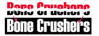
Specs: Haettenschweiler Font, 26 point, Regular styling.
1. Make some letters. Work on the spacing of the letters until they look good (kerning).
2. Make three copies of the original type, four total.
3. Leave one of the words as type.
4. Type/Create Outlines to turn the others to vectors.
5. Leave a black vector untouched.
6. Turn the other two vectors to their respective colors, one black and one white.
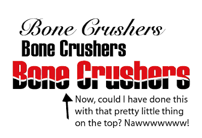
Hold down the eraser tool and drag it through the word, shift-drag keeps it straight, but we are making a line that is more organic, so just zig zag it through like you are cutting it that way with scissors. What you are actually doing is using the eraser to organically cut away the image. What you do not erase will be left. Go all the way through the word with one swipe, do not stop in the middle. When finished it should look like the one below.
Next, ungroup this broken word, then only select the top area. Turn the top part red. Then regroup the two parts, both the red and the black.
Now select that broken word and drag it on top of the white letters.

Once on top of the white, I deleted the black and created another color behind the word. With the white background letters behind the red and black, the middle of those words will always show up as white. If saved for web without the white, then the background of your website will show background color where the white would have been. Your choice. Remember, though, that no matter where your logo is placed, it should have consistency. Choosing the white will allow it to have consistency, and no other color will change the words themselves. As you can see the background color will make a difference to how the rest is viewed. Pick wisely.
Specs: Haettenschweiler Font, 26 point, Regular styling.
1. Make some letters. Work on the spacing of the letters until they look good (kerning).
2. Make three copies of the original type, four total.
3. Leave one of the words as type.
4. Type/Create Outlines to turn the others to vectors.
5. Leave a black vector untouched.
6. Turn the other two vectors to their respective colors, one black and one white.
You can see the vectors chosen below and their colors. I placed a black temporary box behind the white so it could be seen until I use it to build the logo.
Select the letters you want to change. That will be the third one down the previous list. Select the eraser tool by double clicking on it. A dialog box will come up for you to set the diameter. Choose the size that you like for making the white break in the word.
Next, ungroup this broken word, then only select the top area. Turn the top part red. Then regroup the two parts, both the red and the black.
Now select that broken word and drag it on top of the white letters.

Once on top of the white, I deleted the black and created another color behind the word. With the white background letters behind the red and black, the middle of those words will always show up as white. If saved for web without the white, then the background of your website will show background color where the white would have been. Your choice. Remember, though, that no matter where your logo is placed, it should have consistency. Choosing the white will allow it to have consistency, and no other color will change the words themselves. As you can see the background color will make a difference to how the rest is viewed. Pick wisely.
Character Dialog Box in Typography.
RULE OF THUMB: IF IT FEELS LOOKS RIGHT, DO IT!
You have a special dialog box for working with non-vectored type fonts. This box lets you choose the font, choose the font style, choose the font size, kern letters, set the leading, set tracking, set vertical and horizontal scale, set the baseline shift, rotate the character, and much more. Choose Window/Text/Character to bring up this dialog box.Below is a brief explanation of the different choices in the Character Dialog Box. Please study online if you want to know more about Typography. It is quite the journey and very rewarding.
Everybody does this. (smile)
Mandatory: Choose a Font
A basic tool of the graphic designer is fonts. Simply put, fonts are serif or sans serif. Sans is a word meaning "without." Sans serif fonts do not have projectiles or protrusions from the body. Serif fonts, on the other hand do have projectiles and protrusion from the type font body. When choosing a font for a logo design, you may have more choices than you should. Make sure the font makes sense for your type of business and make sure the font can be read easily. There is a two-second law, which I call the billboard effect. Can your words be read by a person in a speeding car passing by a billboard with your logo design?

Mandatory: Choose a Font Style
Fonts have different styles, and not all fonts have every style. When your font is selected, you can see the styles available for that font in the character dialog box.
Mandatory: Set the Font Size
Font sizes are exact. A 10 point font is always a 10 point font. You can choose a font size from the dialog box, or type in a number that corresponds to the size you want. Point size 26 is not a predetermined selection, so I typed in the number 26 into the size box, and entered. It changed my font to point size 26. Although point size is an exact science for the computer, different fonts sizes have optical variations. For your example, I have chosen two fonts, one a serif and one a flourishing script. Each font example ends with the point size it has been given. You can see the difference in these examples easily.
The rest of these choices are for smart people. Want to continue? (smile)
Set the Kerning
Kerning is the space between letters in a font group (word).
Set the Word Spacing
Word Spacing is the space between words. You can use your kerning tool to do this, as a non-vectored font is seen by the Kerning settings even in the blank spaces.
Set the Horizontal Scale
Set the Baseline Shift
The baseline of a letter is the bulk of the letter, without descenders or ascenders.
Set the Leading
Leading is set only by the baseline of letters, not the ascenders or descenders.
Set the Tracking
Tracking is the way to space between letters in a whole word. Theoretically, if you have kerned the letters so that they all fit proportionately with each other, tracking should be successful.
Set the Vertical Scale
Notice that the changes in the vertical scale also sets leading accordingly.
Use Character Rotation if desired
Rotation is configured at every degree, completely at every angle. Usually, tracking has to be reconfigured for extreme rotations.
Your language should be set and we will leave anti-alias at default.
So that is your Character Box for Typography, and is probably the most useful tool I have ever used.
Have fun using it to configure your type.
Vector a Font
Open Illustrator:
Choose New from File.
Name your document Font Vector, Color Mode is RGB, Raster Effects should be High. CMYK Color Mode is for printing, RGB Color Mode is for Web and Mobile Devices. Choose High Raster Effects, you may always lower a resolution, but you cannot higher one from low resolution.
Choose your Font icon (the T), and click on the artboard (blank page), you should see the typing icon pulsating, ready to type. Choose a font from your list under Character.
Type it into the artboard.
Select it with the black arrow, this is your selection tool.
Instead of looking like the Regular Font, it should look like the Vectored Font when selected with the selection tool.

Fonts that are vectored are by default grouped, I usually copy the vectored font that is grouped, and set aside that grouped one. I play with a copy that I ungroup, allowing me to manipulate the fonts separately. That way, I do not need to recreate outlines from the typed font in case I want to start over. I have a clean copy set aside within the document. I have found that it is a good idea to set aside a non-vectored copy also, as a vectored font, when selected, does not give you the information about that particular font (because it is now an image, and not a font).
So that is how you get a font vectored. Now that it vectored, you can play around with it. Please see Vector Manipulations.
Choose New from File.
Name your document Font Vector, Color Mode is RGB, Raster Effects should be High. CMYK Color Mode is for printing, RGB Color Mode is for Web and Mobile Devices. Choose High Raster Effects, you may always lower a resolution, but you cannot higher one from low resolution.
Choose your Font icon (the T), and click on the artboard (blank page), you should see the typing icon pulsating, ready to type. Choose a font from your list under Character.
Type it into the artboard.
Select it with the black arrow, this is your selection tool.
Instead of looking like the Regular Font, it should look like the Vectored Font when selected with the selection tool.

Fonts that are vectored are by default grouped, I usually copy the vectored font that is grouped, and set aside that grouped one. I play with a copy that I ungroup, allowing me to manipulate the fonts separately. That way, I do not need to recreate outlines from the typed font in case I want to start over. I have a clean copy set aside within the document. I have found that it is a good idea to set aside a non-vectored copy also, as a vectored font, when selected, does not give you the information about that particular font (because it is now an image, and not a font).
So that is how you get a font vectored. Now that it vectored, you can play around with it. Please see Vector Manipulations.
Subscribe to:
Comments (Atom)


